Stiho
UX/UI design (lead)
CX strategy
User research and testing
Conversational UI
Design system
Context
As one of the Netherlands’ most trusted suppliers of building materials, Stiho has been a partner to builders for almost a century. But the construction world is changing fast: professionals are under pressure, digitisation is accelerating, and the demand for advice, sustainability, and speed keeps growing. As a committed family business, Stiho wanted to redefine its role: from supplier to full-service partner for builders. A brand that not only delivers materials but makes building easier, faster, and smarter across every channel.
Insights & Strategy
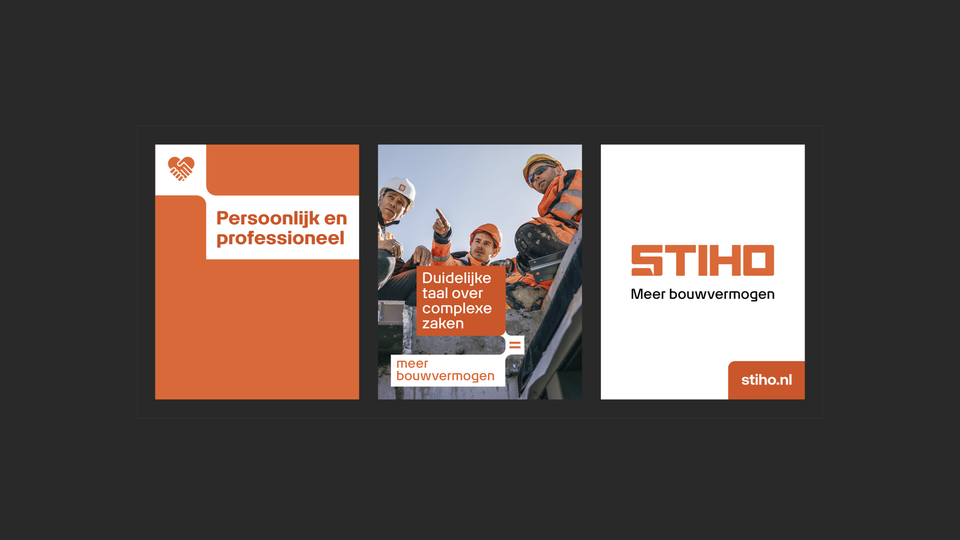
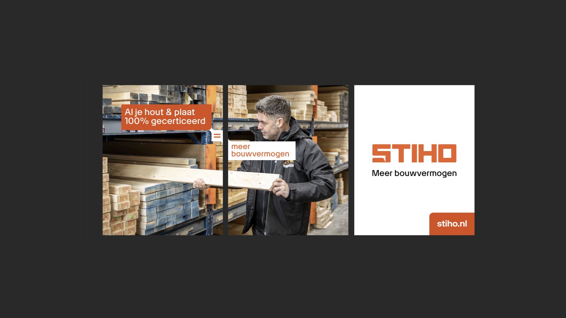
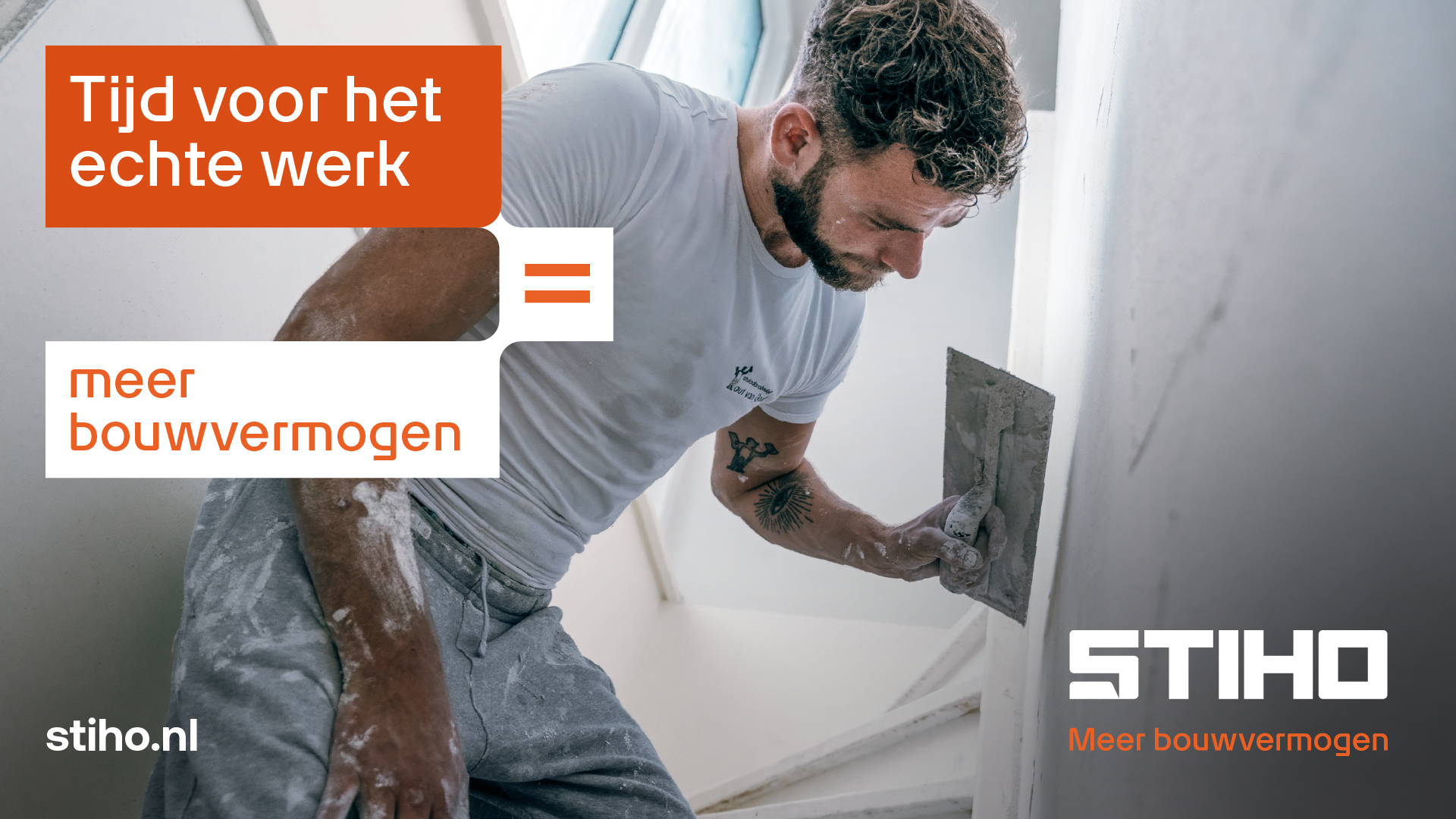
Ahead of its 100th anniversary, Stiho partnered with TD to transform its positioning, identity, and customer experience. The new brand positioning “More building power” reflects Stiho’s role as a reliable partner who gives professionals the tools, time, and confidence to focus on the real work. The promise “Time for the real work” sums it up: Stiho takes care of the rest.
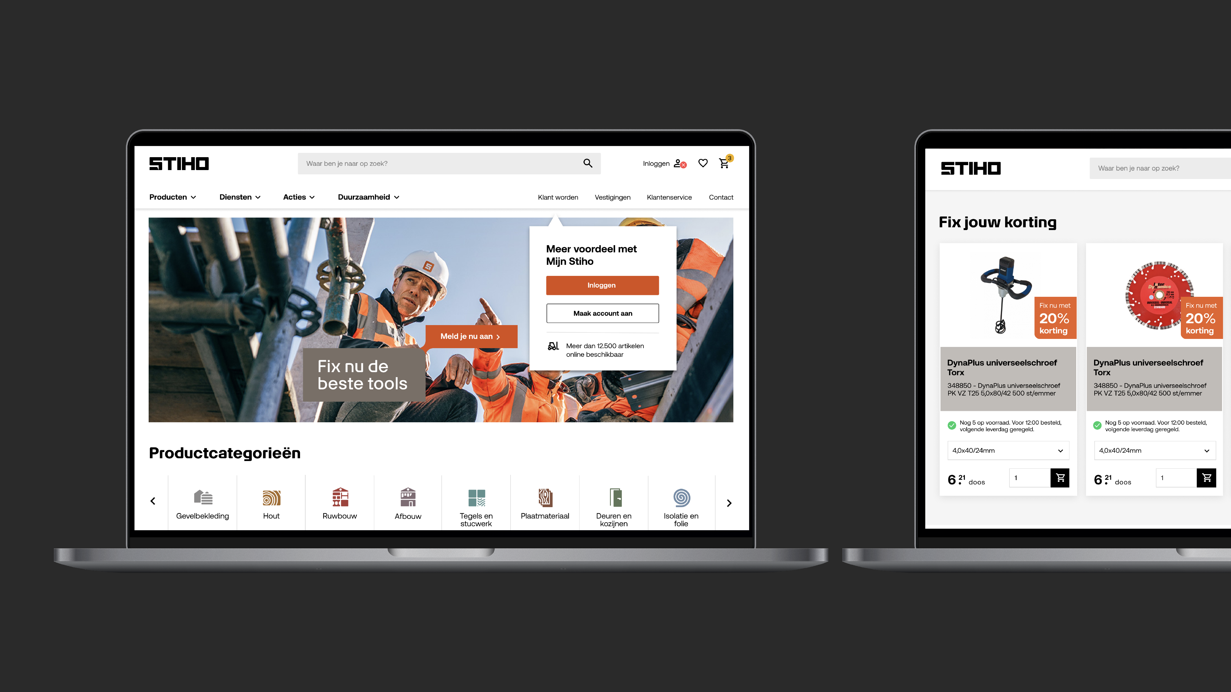
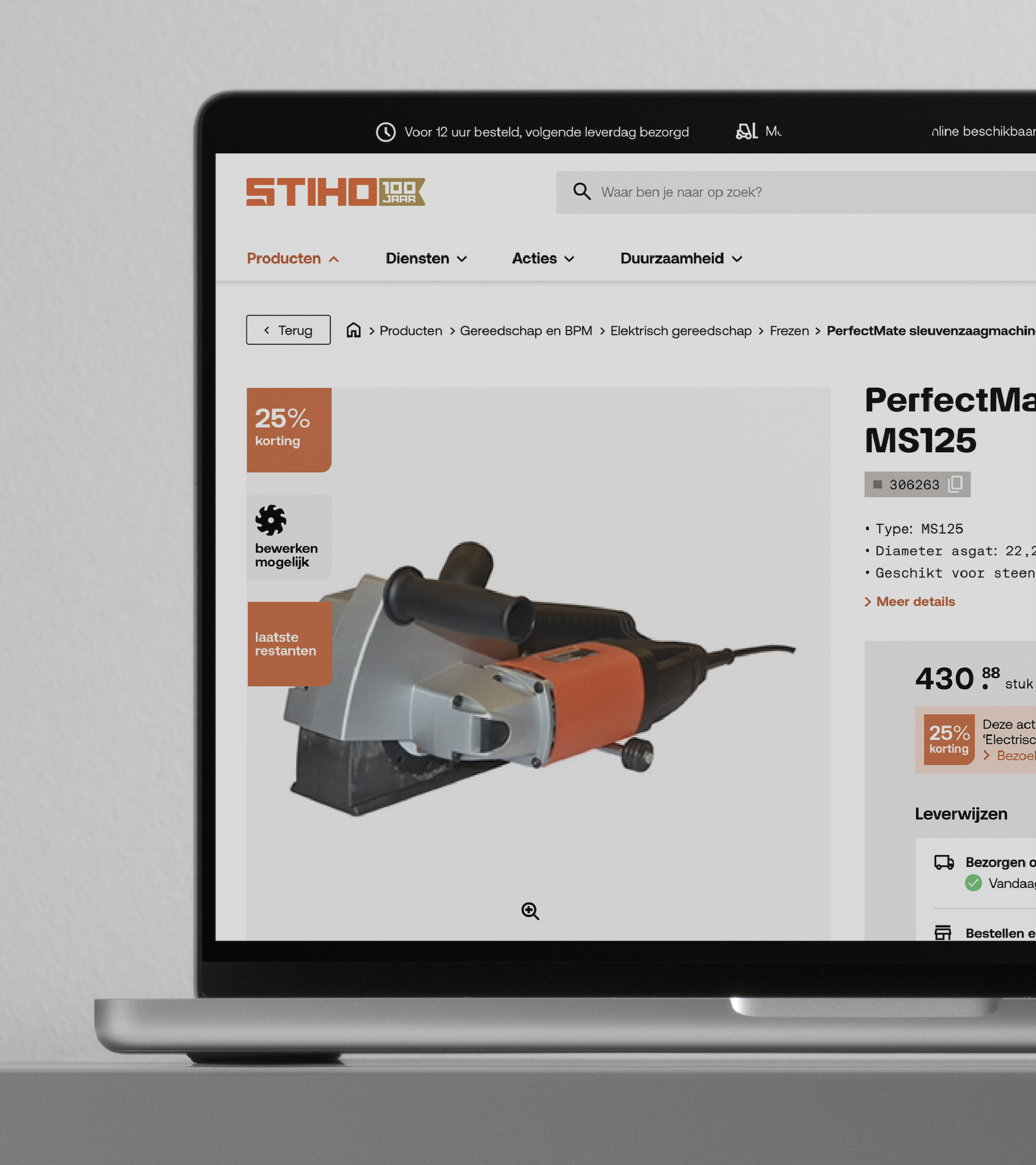
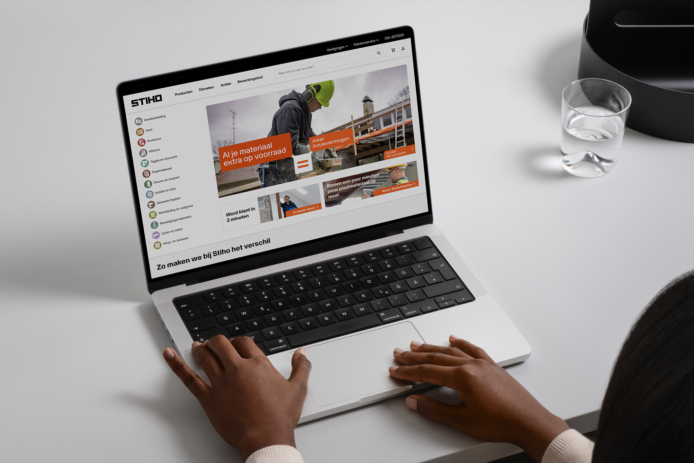
A modular identity system was built around stacked layers – a visual metaphor for how construction works. In stores, a new concept combines clear routing, personal contact, and speed. Digitally, a new webshop and app offer the same experience: fast, intuitive, and connected to builders. Smart filters, live stock, and project tools make ordering seamless. A brand platform, toolkit, and workshops ensured consistent rollout and internal alignment.
Concept & Design
Stiho now stands on a strong foundation for
growth – ready for new categories, propositions, and logistics hubs.
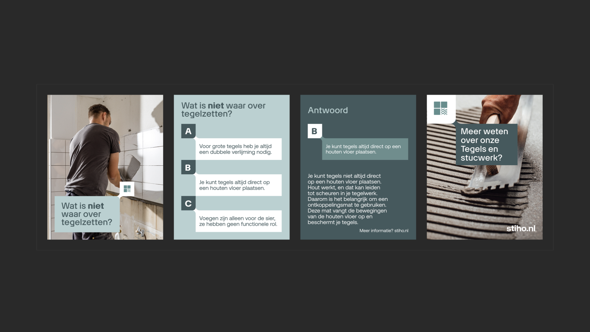
Customers experience one clear brand wherever they meet Stiho: online, in-store, or on-site. The new store formula is clear and human. The digital journey is personal and fast.
Customer loyalty and conversion are up – builders order more often, faster, and with purpose. Stiho has become the builder’s true partner – delivering more building power every day.
Context
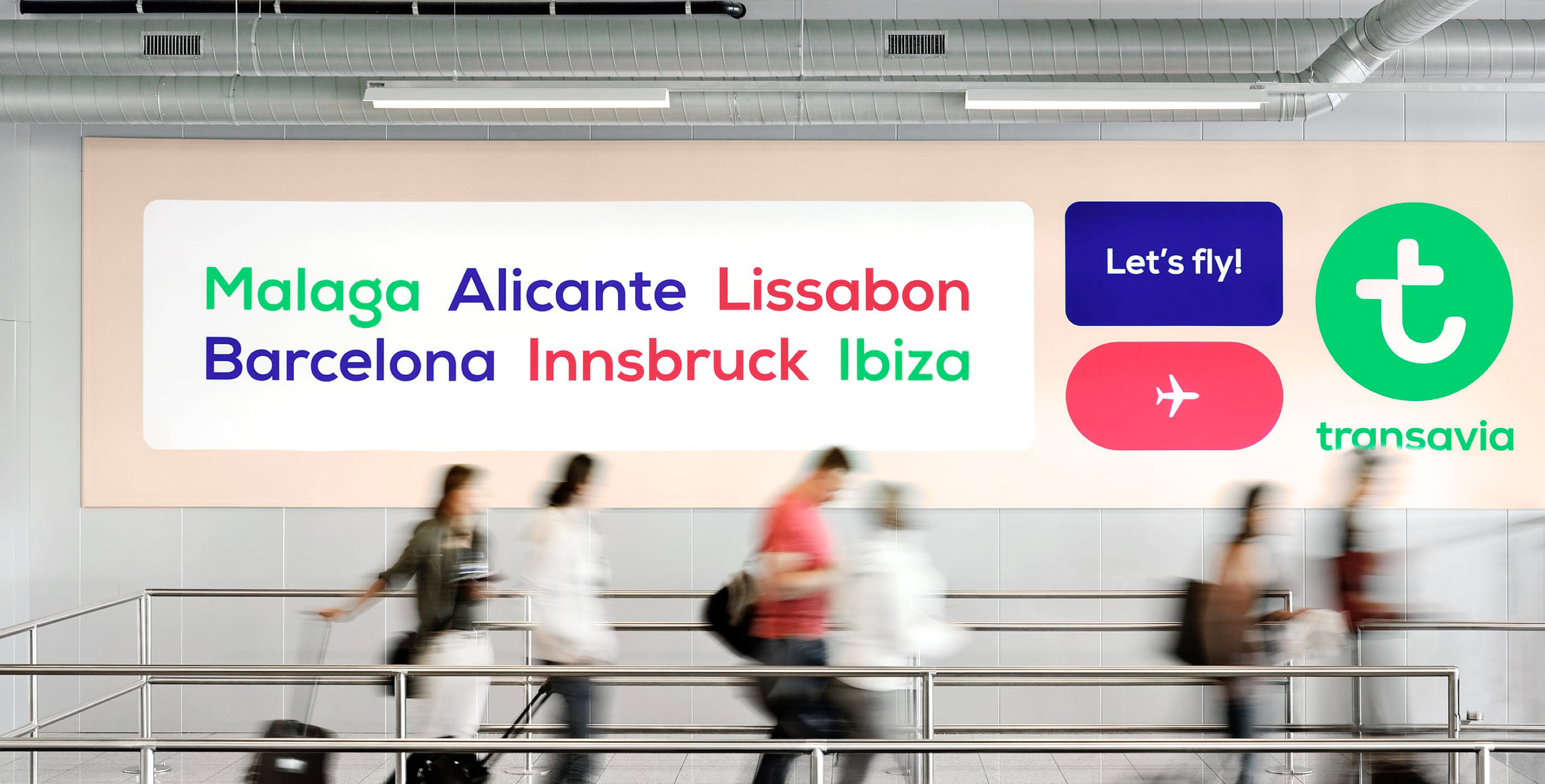
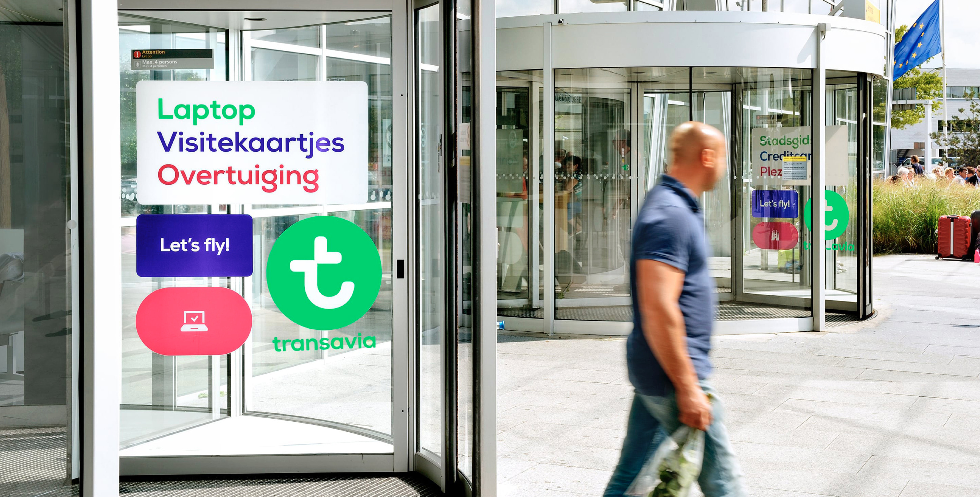
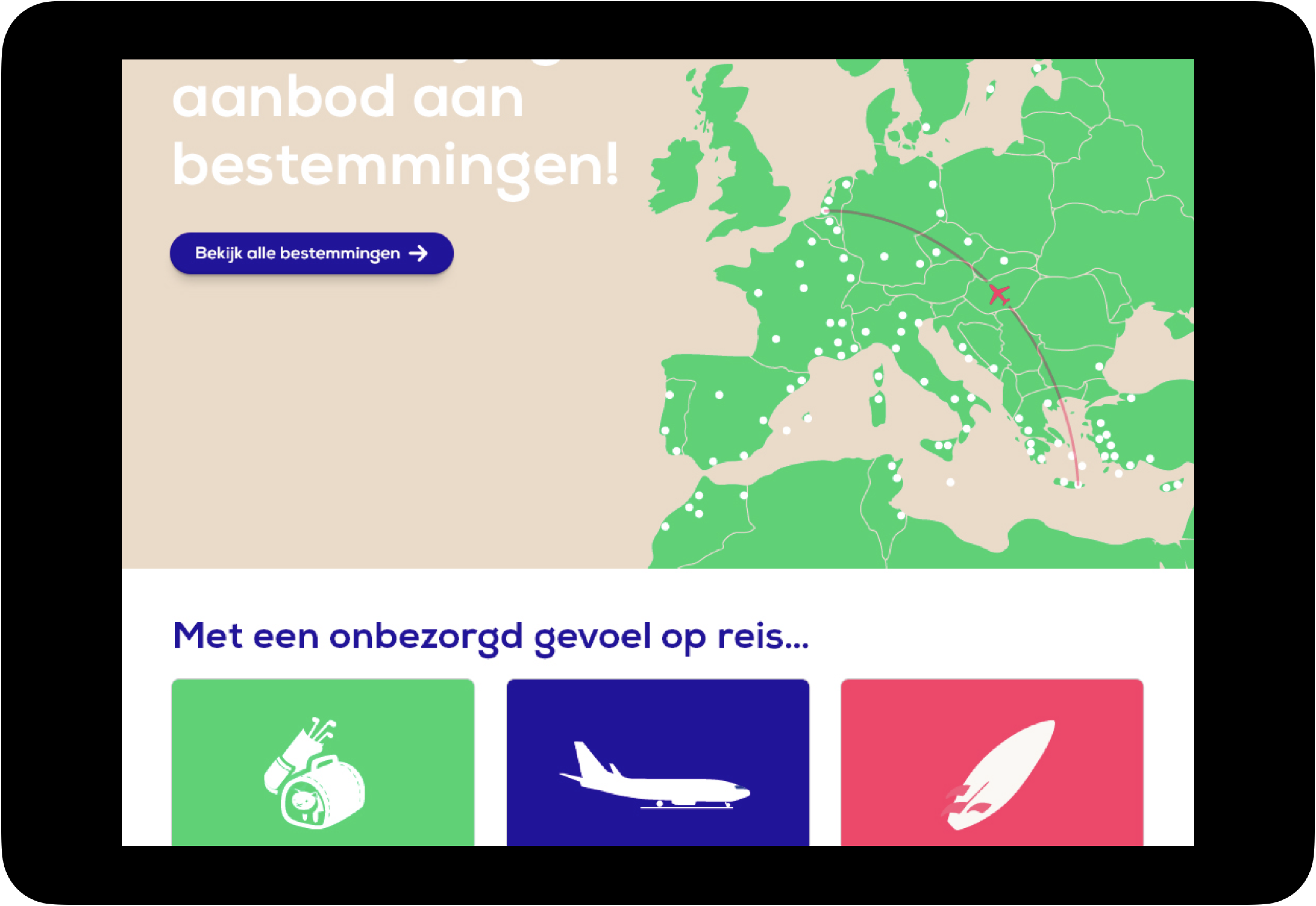
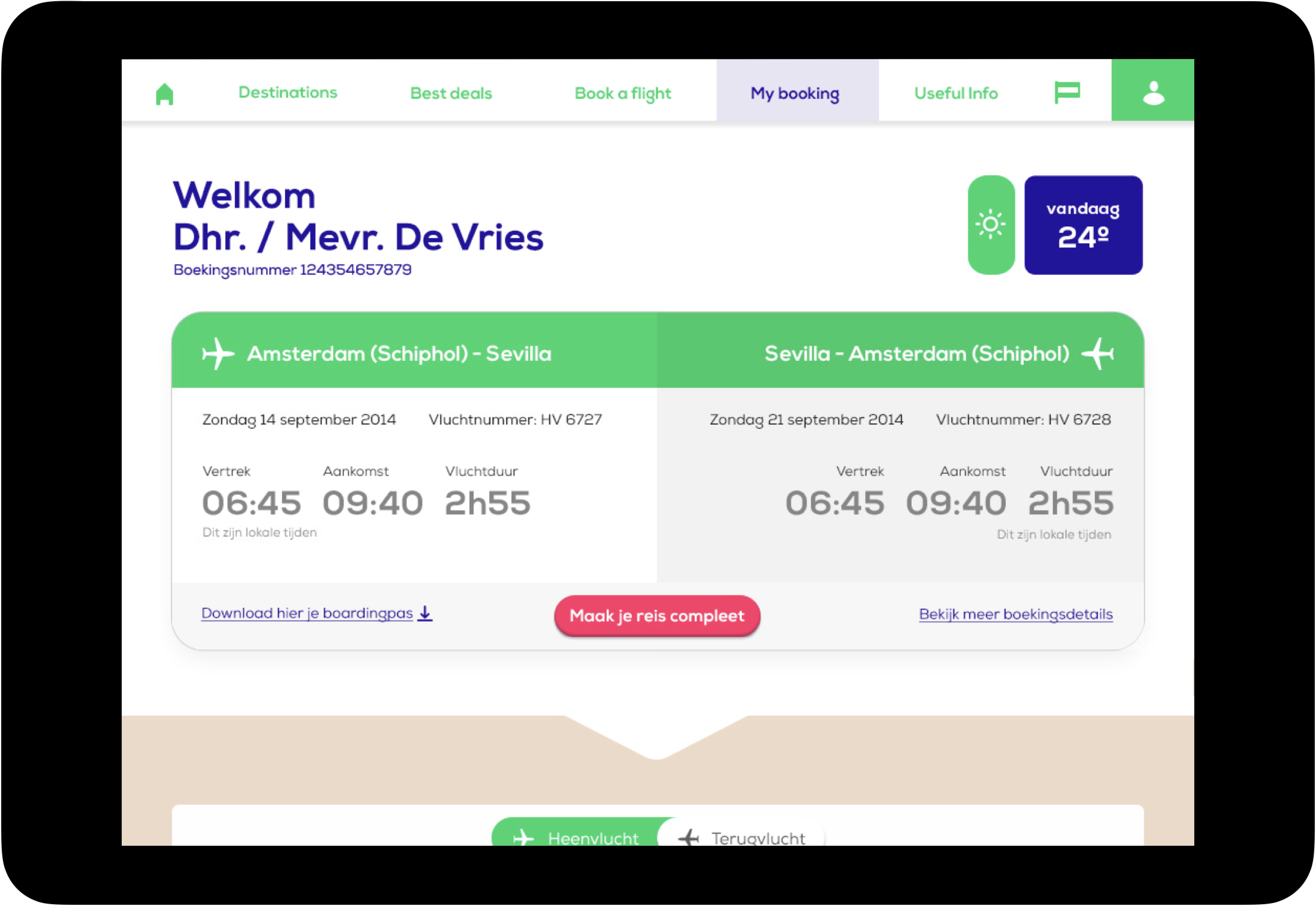
As a result of Transavia's ambition to establish a 1-on-1 relationship with every passenger and to reposition itself as a European low-cost airline with a 'warm' feeling, we designed a completely new digital platform and ecosystem over a period of several years.
Accenture, Mirabeau and Studio Dumbar worked closely together on this project, with Mirabeau in the design lead role given the focus on digital channels. This resulted in a new brand and user experience that is essentially human-centric.
Insights & Strategy
The project started with the development of a prototype for 'My Transavia'. This prototype set the stage for the redesign of the entire digital ecosystem and the new brand identity, including the livery of the aircrafts.
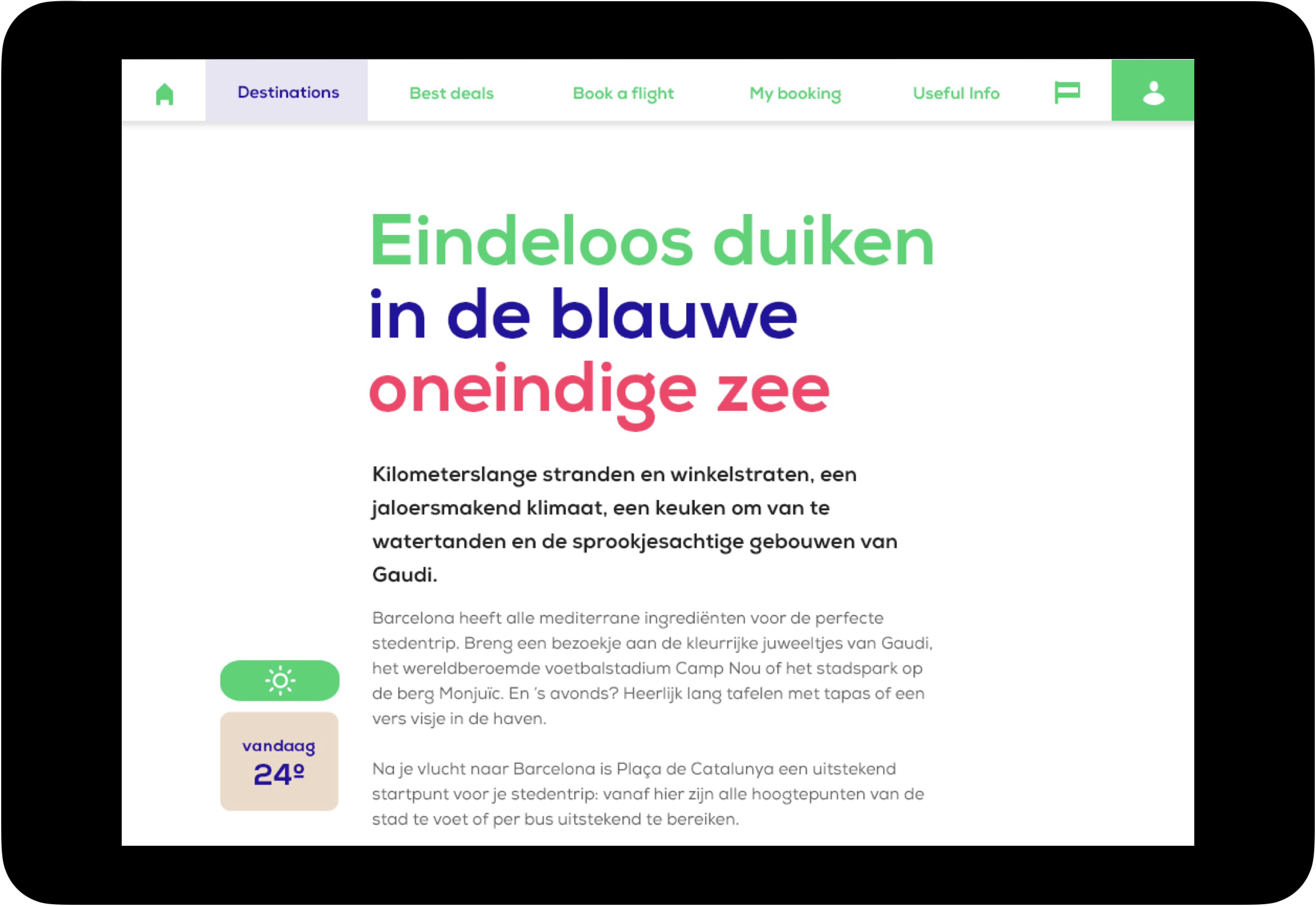
The design direction is, in addition to an 'artist impression' prototype, defined in an extensive set of design principles for the different perspectives: look and feel, interaction, tone of voice, content and performance (technology).
In the process, much attention was paid to creating support among Transavia employees. The design team has worked full-time on location in Schiphol for several years.
Concept & Design
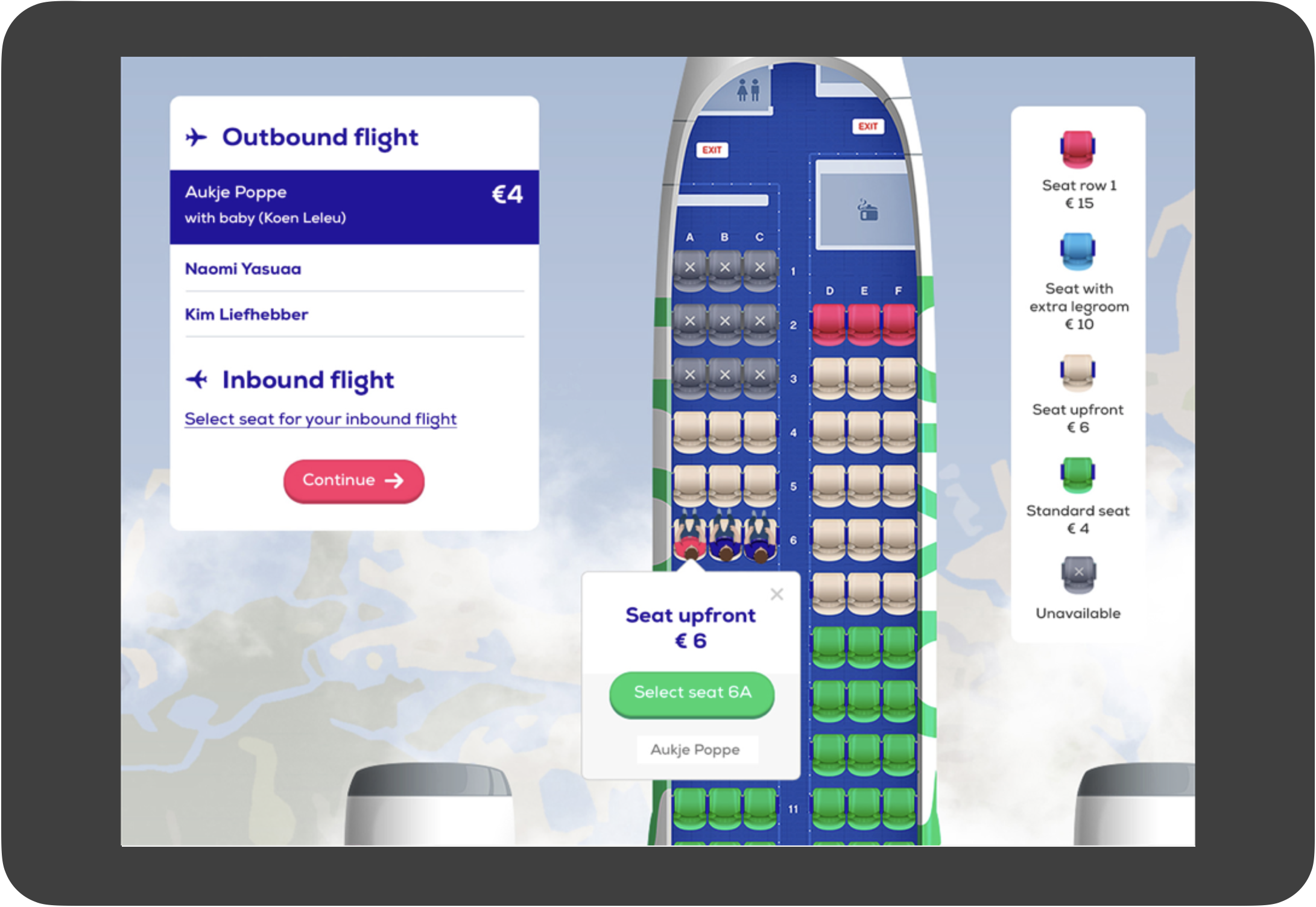
Design and research are in this project always closely intertwined. Often, users react unexpectedly positively to innovations in design, such as a dynamic positioning of the logo and the presentation of the seat map as a rich personalized experience. In this way, research goes hand in hand with creativity and innovation. In this way, the end result is not driven by conventions and is really human centric. On a practical level, A/B testing and neuroscience are also used to optimize conversion.
Given the scope of the project, the range of activities and deliverables is very broad: from defining a digital and brand strategy, to developing a verbal and motion identity, and not to mention all the digital craftsmanship such as drawing the seatmaps and coding the micro-interactions.
Collaboration
In this project, in which digital agency Mirabeau closely collaborated with graphic design agency Studio Dumbar we designed a whole new brand and user experience.

It's a pleasure
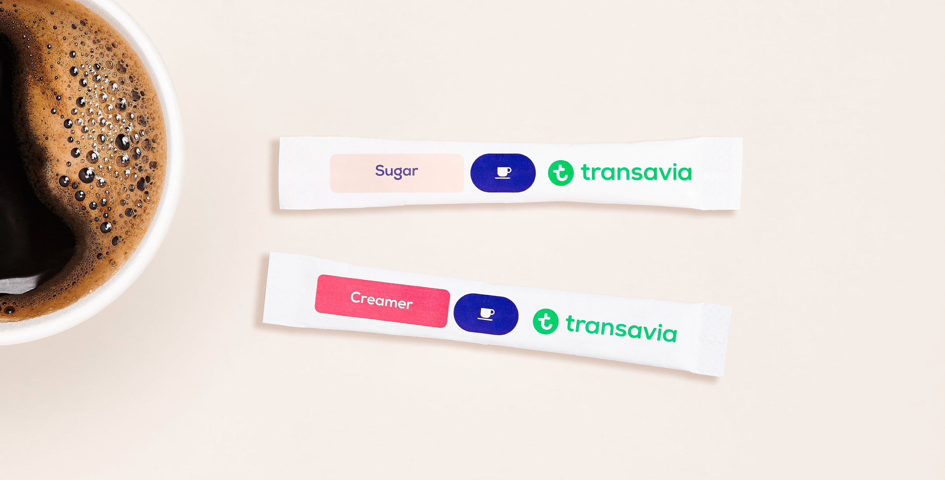
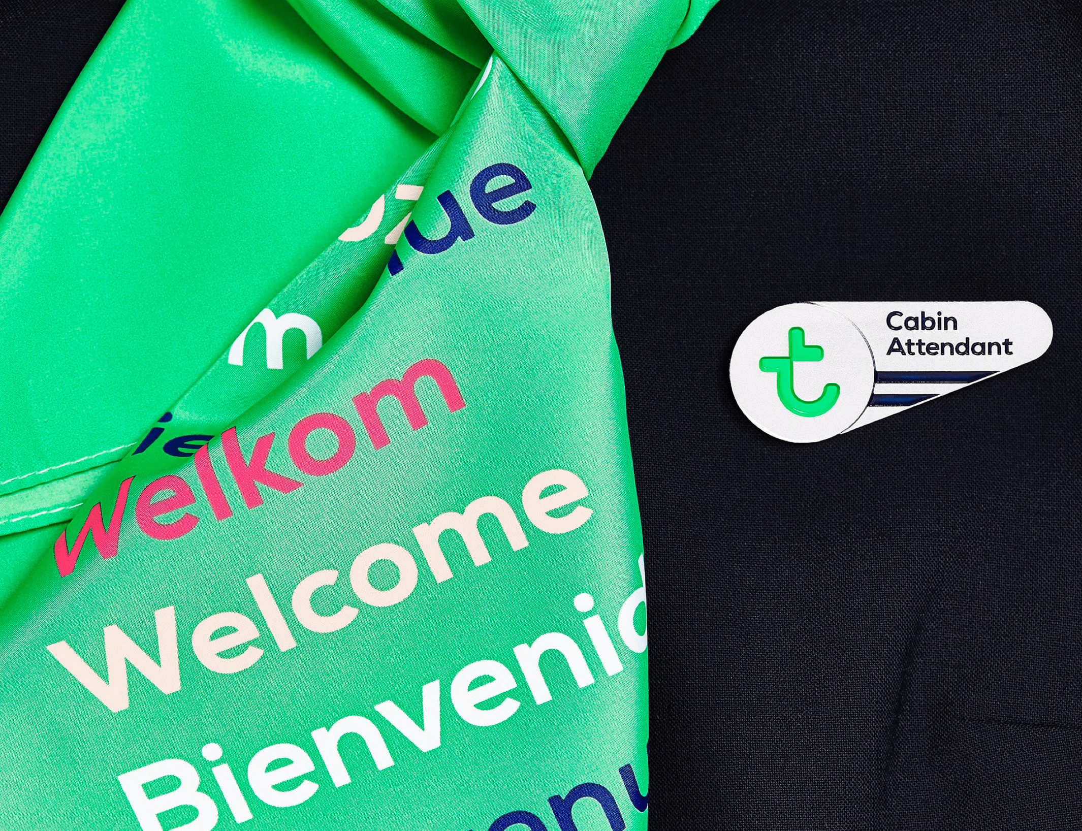
The identified core strength of Transavia is the warm and personal approach of the cabin crew. This can be summarized as ‘It is a pleasure’. This principle became the guiding principle in all communication.
The jury report of the SpinAwards describes how existing web conventions have been abandoned, even in the booking flow. In the words of the jury an encouragement for other agencies and brands to actually innovate from a user perspective.
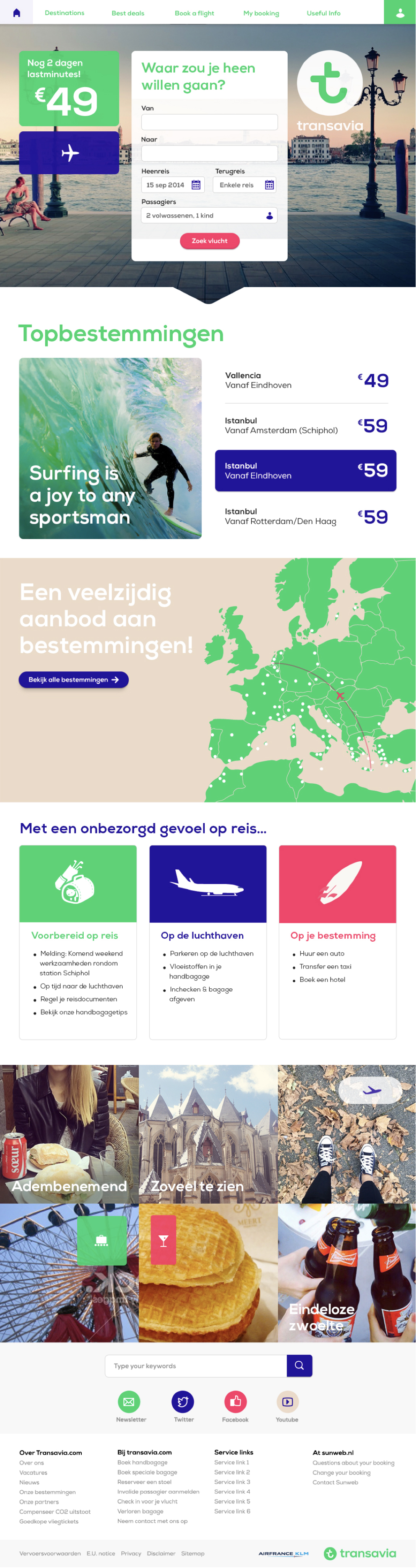
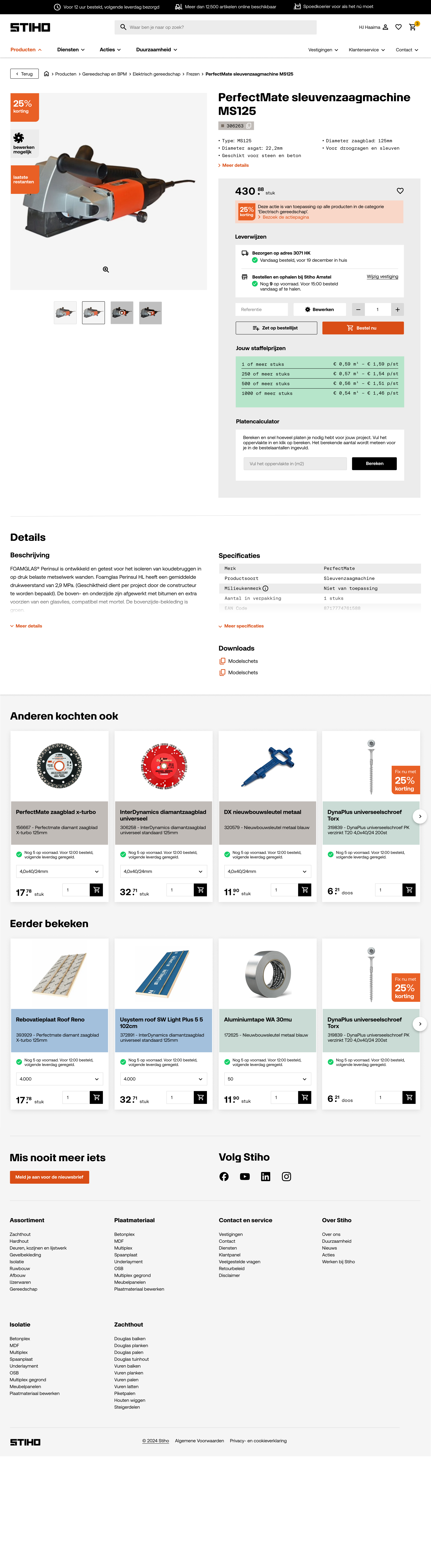
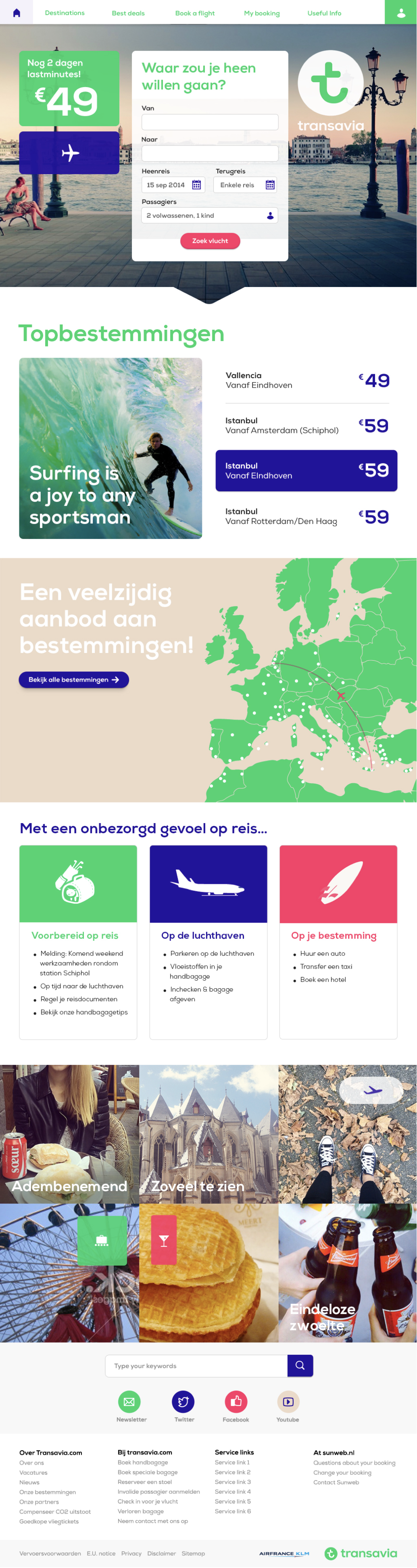
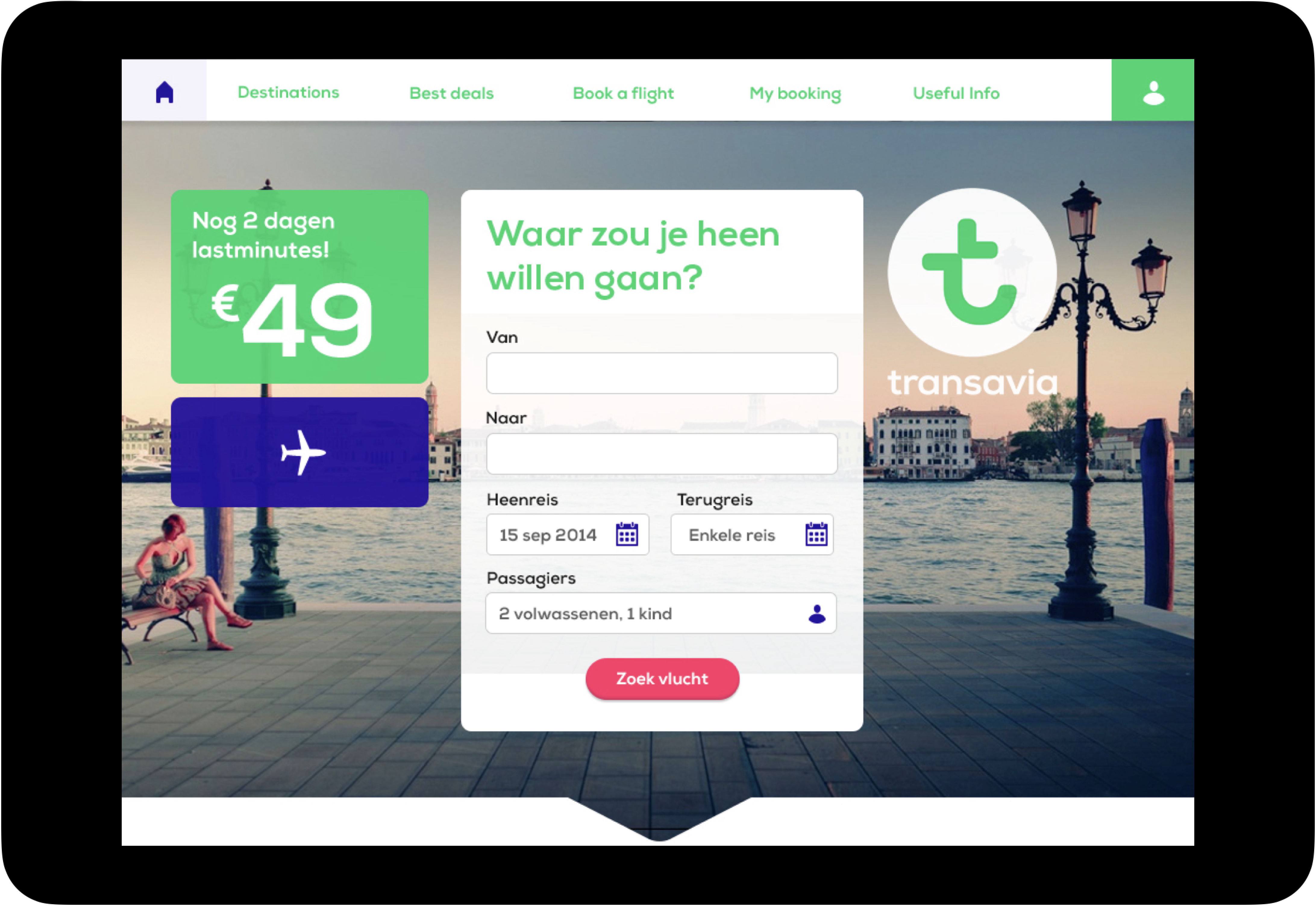
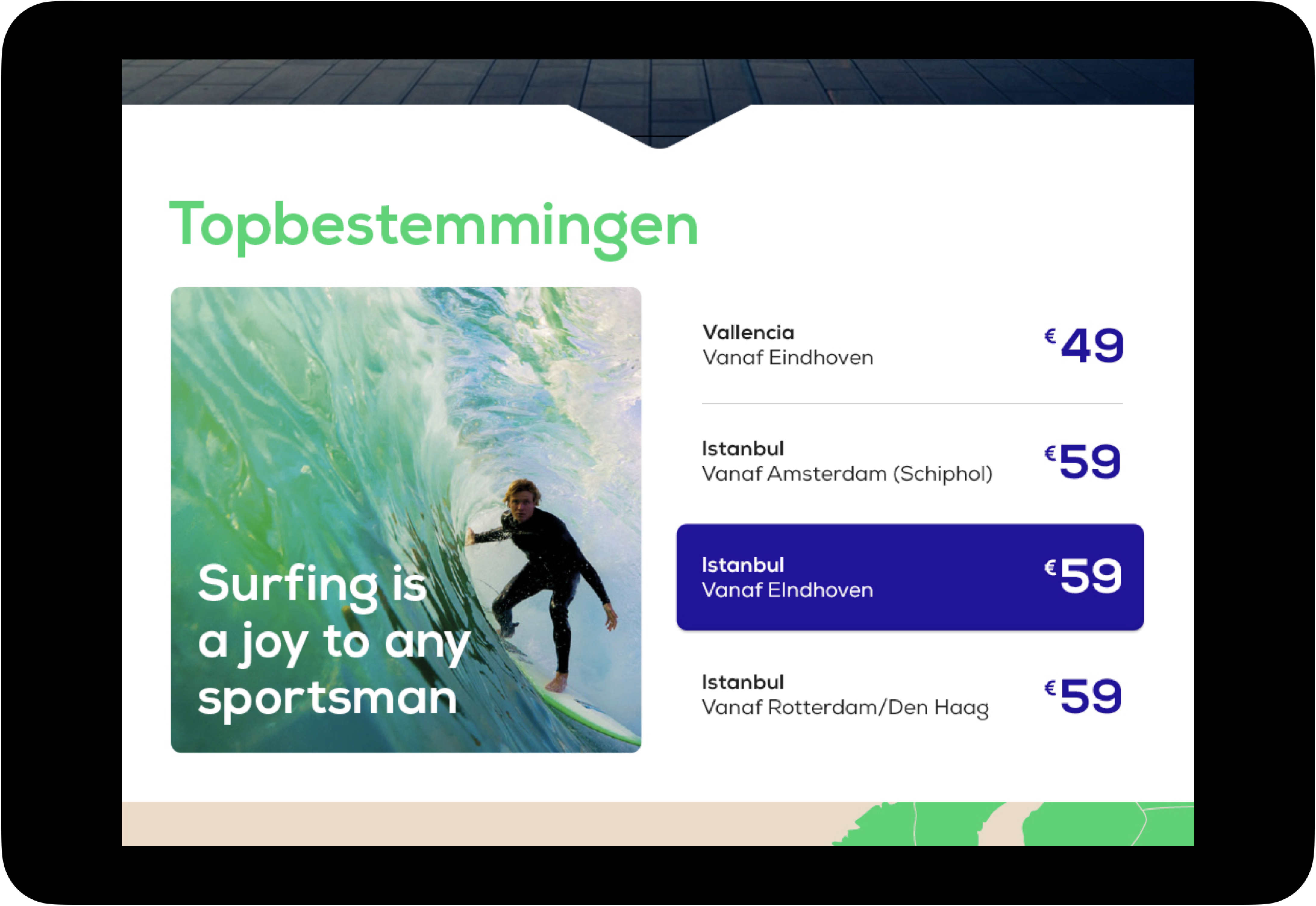
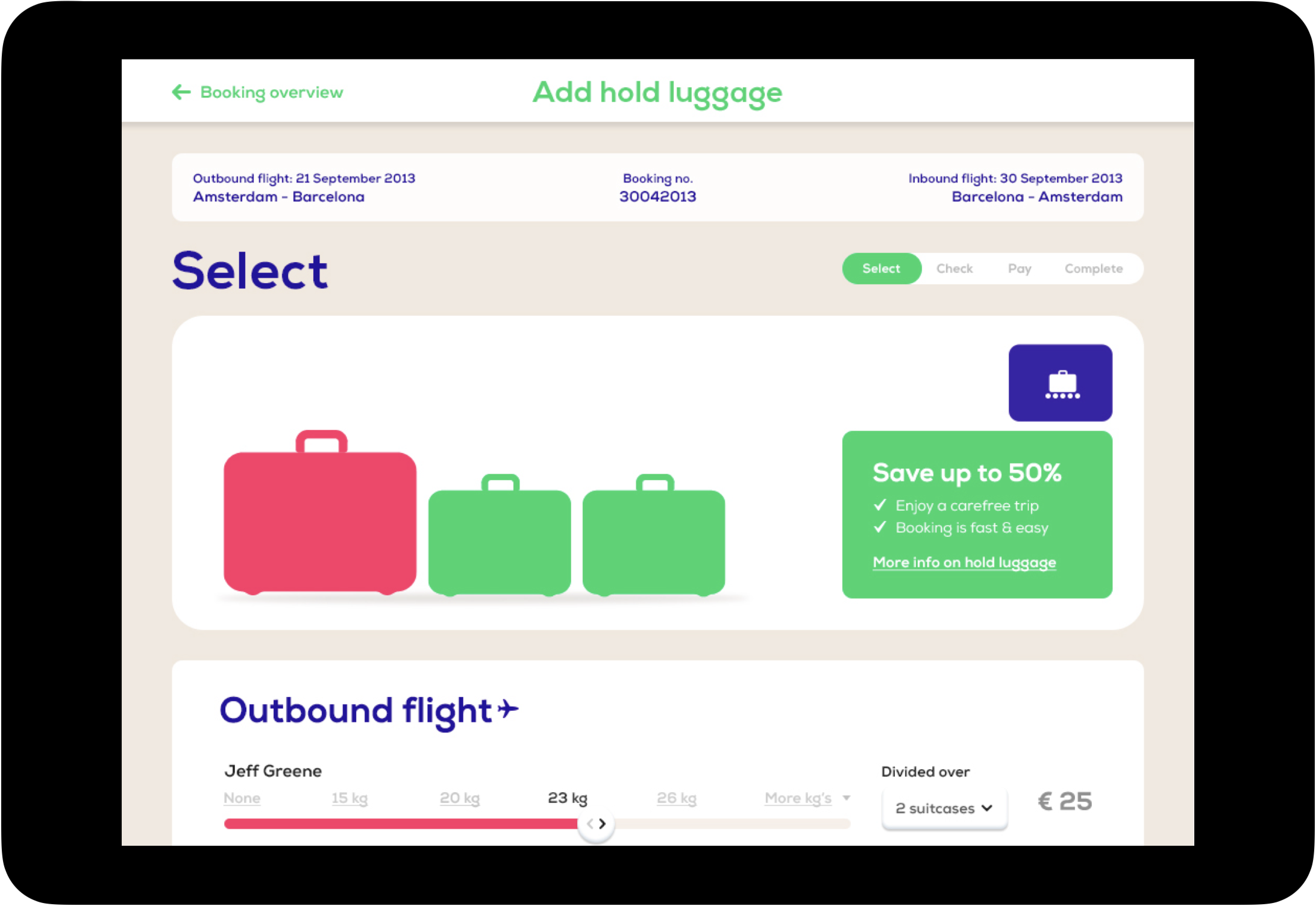
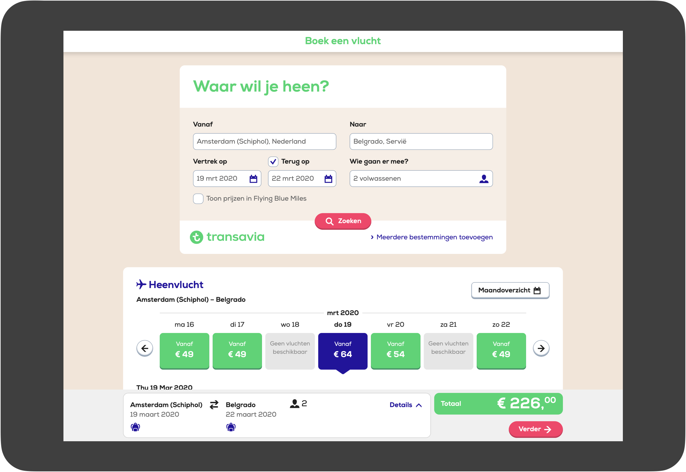
Besides being fun, the design is also smart and personal. A line of code detects the battery level of the used device. When this is low, a minimal more functional experience is shown. A perfect example of dynamic design. The presentation depends on context and user.